7 Golfcore Color Combinations That Actually Work Off the Course
Quick Answer: Golfcore reads as expensive when the palette is restrained and tonal, and reads as costume when it uses the bright primaries and hard contrasts of actual golf apparel. The seven combinations below all work on the same principle - two neutrals plus one controlled accent, with the accent kept small.
The fastest upgrade to any golfcore outfit is removing one color from it.
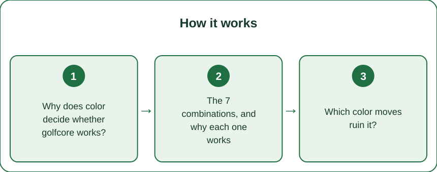
Why does color decide whether golfcore works?
Because the shapes are borrowed and the palette is what makes them yours.
Golfcore is built from a small, recognizable set of pieces - the polo, the pleated skort, the sleeveless knit vest, the cable sweater, the visor, the loafer. These are functional garments with a strong association, and worn in their original colors they read unambiguously as sportswear.
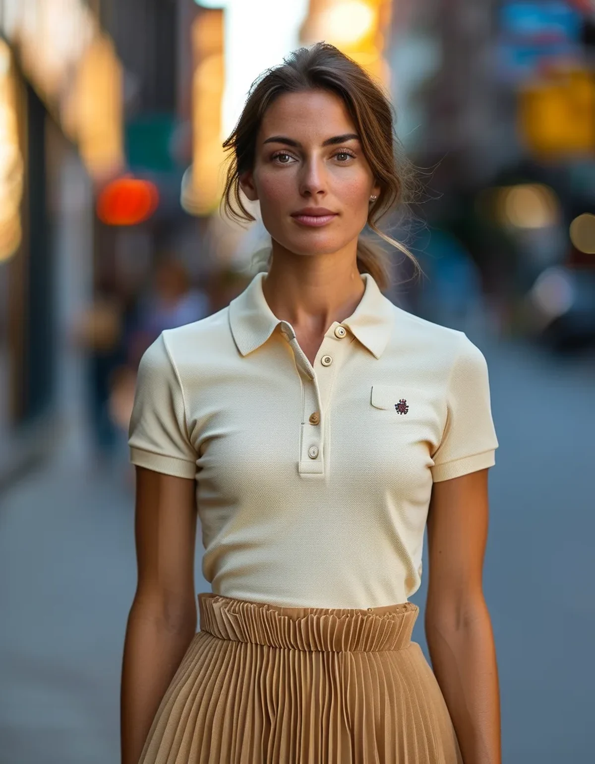
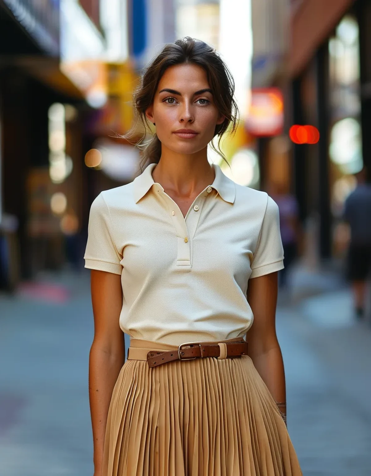
What converts them into fashion is context, and the strongest context signal available is color. A white polo with a navy pleated skirt reads as golf. A cream polo with a camel pleated skirt reads as a considered outfit that happens to use golf shapes.
Same garments, entirely different message, and the only variable is palette.
The underlying reason is that performance golf apparel uses color the way all sportswear does: high contrast, saturated brights, and visible logo blocking, all designed for visibility and for brand recognition at distance. Fashion uses color in the opposite direction - lower contrast, more tonal, more muted, with any brightness deployed deliberately and sparingly.
So the rule that governs everything below: lower the contrast, mute the saturation, and limit the count. Two neutrals plus one accent is the working formula, and the accent should occupy a small share of the outfit rather than a whole garment.
One useful test before leaving the house: photograph the outfit and look at the picture in black and white. If the image is full of hard light-and-dark blocks, the contrast is too high and it will read as sportswear. If it reads as a range of close mid-tones with one point of interest, you have it right.
The 7 combinations, and why each one works
1. Cream and camel. The most reliable in the entire category. Both are warm neutrals a step apart in value, so contrast is very low and everything reads as one considered piece. A cream polo with a camel pleated skort or trouser is close to foolproof, and it looks costly regardless of what it cost. Add a tan leather loafer and stop there.
2. Sage and ivory. Sage green does something specific: it references golf’s actual environment without any of golf’s apparel colors. It is a muted, slightly grey green that behaves almost like a neutral, so it pairs with ivory or oatmeal without any tension. This is the combination that reads most clearly as fashion rather than sport.
3. Charcoal and oatmeal. The cool-toned alternative for anyone who does not wear warm neutrals. Charcoal replaces the black that golfcore should generally avoid - black is too hard against these shapes and pushes the outfit toward corporate. Charcoal trouser, oatmeal knit vest, white shirt underneath.
4. Navy and white, with a strict rule. The classic, and the riskiest, because it is exactly what actual golf apparel looks like. It works only if the proportion is unbalanced - a mostly-navy outfit with a small amount of white, or the reverse. Equal blocks of navy and white read as a uniform. Keep one color clearly dominant and it reads as classic.
5. Tonal brown. Chocolate, tan, and camel together in one outfit. Full tonal dressing in a single family is a strong look in any category and it suits golfcore particularly well, because the shapes are simple enough to carry the repetition. Vary the textures - a knit, a woven, a leather - so the tones do not flatten.
6. Butter yellow and cream. The one soft brightness that works. Butter yellow is desaturated enough to behave like a neutral against cream, and it brings the preppy warmth golfcore wants without the shout of a true primary. Best as the sweater or the polo, with everything else neutral.
7. Burgundy as the accent, never the base. Burgundy is the correct autumn accent for this category - it has the heritage association without being a sport color. Keep it to one element: a knit vest, a belt, a loafer, a stripe in a sweater. A full burgundy outfit tips into something else entirely.
Which color moves ruin it?
Five, in rough order of how often they appear.
Bright primary red, royal blue, or kelly green. These are performance apparel colors, full stop. A saturated red polo reads as golf equipment no matter what it is paired with, because that saturation only exists in sportswear and children’s clothing. If you want red, it should be a muted brick or a deep burgundy.
Neon anything. High-visibility colors exist in golf apparel for reasons that have nothing to do with style. There is no fashion version of this.
Hard white-on-black. Maximum contrast is the opposite of the tonal principle, and black is already the weakest neutral for these shapes. Charcoal and cream do the same job with far better results.
Three or more colors with none dominant. The most common failure in practice, and it usually happens by accumulation rather than choice - a green polo, a navy skirt, white shoes, a brown belt, and a red visor is five colors, each of which was fine alone. Count the colors in the mirror before leaving.
Visible logo color that fights the palette. A large contrasting logo introduces a color you did not choose, and on a small garment it can be a meaningful share of the visible area. Either match the logo tone to the outfit or choose pieces where it is subtle.
The pattern behind all five: golfcore fails when it looks like it is trying to be seen from a distance. Actual golf apparel is designed for exactly that. Fashion is not.
A quick correction if an outfit feels off and you cannot identify why - remove one color. Not one garment, one color. Swap the contrasting belt for a tonal one, or the white shoe for a tan one. It solves the problem far more often than adding anything does.
How does the palette shift for autumn?
Warmer, deeper, and more textural, while keeping the same low-contrast structure.
The transition from late summer into autumn is the strongest season for golfcore, because the layering pieces the category is built on - the knit vest, the cable sweater, the quarter-zip - finally make sense in the actual weather.
What changes:
- Cream and ivory shift toward oatmeal and camel. The same tonal relationships, moved a step warmer and deeper. A summer cream-and-white outfit becomes an autumn oatmeal-and-camel one with no change in structure.
- Sage deepens toward olive and moss. Olive is genuinely one of the best autumn golfcore colors and it pairs with camel, cream, and brown equally well.
- Burgundy and rust become available as accents, and they are the two that most clearly signal the season.
- Texture takes over from color as the interest. In a restrained palette, a cable knit, a ribbed vest, corduroy, and suede provide the variation that a brighter palette would provide with hue. This is the main reason autumn golfcore looks richer than summer golfcore.
The layering order that works: a fine-gauge polo or shirt as the base, a knit vest or sweater over it in a close tone, and outerwear in a neutral that anchors both. Keep all three within two or three steps of each other in value and the layering reads as intentional rather than accumulated.
One practical autumn note specific to this category: the pleated skort with opaque tights is the transitional move that extends the whole wardrobe by two months. Keep the tights in a tone close to the skirt or in a warm neutral - a hard black tight under a camel skirt reintroduces exactly the contrast problem the palette was avoiding.
FAQ: Golfcore Color Questions, Answered
Can I wear golfcore if I do not suit neutrals?
Yes, but shift the neutrals rather than abandoning them. Cool-toned people are often better in charcoal, oatmeal, sage, and ivory than in camel and cream, and the tonal principle holds either way. What matters is low contrast within your own palette, not a particular set of colors.
Is black really off-limits?
Not forbidden, but it is the hardest neutral to make work here. Black creates high contrast against the light colors golfcore relies on, and it lacks the heritage warmth that makes the category read as classic. Charcoal, navy, and deep brown all do the job with less risk. Black as a small accent - a shoe, a belt - is fine.
How do I stop looking like I am actually dressed for golf?
Three things: soften the contrast, remove the visor, and add one non-golf piece. A tailored coat, a good leather bag, or a real shoe rather than a sport shoe immediately relocates the outfit. The palette does most of the work, but a single non-athletic element confirms the intention.
Do these combinations work on the actual course?
Mostly, though check your club’s dress code, which may require specific colors or collars. The muted palettes here are all course-appropriate; what changes on the course is that performance fabric matters more than tone. Many golfcore pieces are fashion-fabric versions that will not handle four hours of sun and movement as well.
TL;DR:
- Golfcore silhouettes are borrowed, so the palette is what separates fashion from costume.
- The formula is two neutrals plus one small accent, with low contrast and low saturation throughout.
- Cream and camel, sage and ivory, charcoal and oatmeal, tonal brown, and butter yellow are the safest; navy and white only with one color clearly dominant.
- Avoid saturated primaries, neon, hard black-and-white contrast, and any outfit carrying three or more competing colors.
- For autumn, shift warmer and deeper and let texture rather than hue provide the interest.
Photograph the outfit and view it in black and white. Hard blocks of light and dark mean it will read as sportswear.
See It in Motion
Seen here: UPF 50+ Adjustable A-Line Running Skort with Pockets — shop it on bubblelime.com
Keep Reading
This article is for general informational and styling purposes only. Fit, sizing, and product availability may vary.